JioGames Experience Revamp
Redesigned the JioGames app with a cleaner UI and
improved navigation for a seamless gaming experience.
Created a bold, intuitive redesign of the JioGames app
focused on usability and modern aesthetics.


Date
May 2025
Role
Designer / Illustrator
Duration
May 2025
Project Goal
Challenge
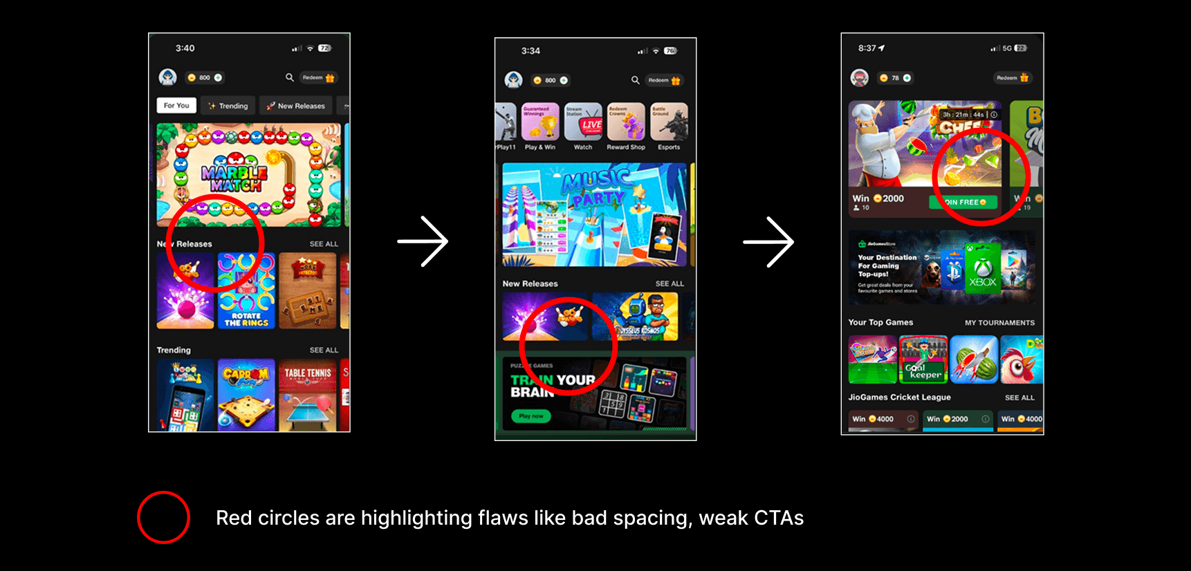
The existing JioGames app suffers from a cluttered interface, unclear navigation, and a lack of structured onboarding, making it difficult for users—especially new ones—to engage smoothly. Game pages provide minimal information, while inconsistent design elements like typography, color usage, design structure
and CTA placement affect usability. Additionally, poor performance and a lack of accessibility features such
as screen reader support and proper touch targets further degrade the overall user experience. These issues highlight the need for a more intuitive, organized, and inclusive redesign during the " JioGames Master Challenge - UI/UX " at JECRC University (Jaipur).
Results
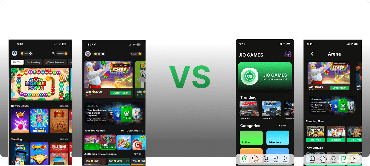
The redesigned JioGames app delivers a clean, intuitive interface with improved navigation and a structured onboarding flow for new users. Game pages now highlight key details at a glance, while consistent typography, color usage, and CTA placement enhance usability. Accessibility features and performance improvements make the app more inclusive and responsive, resulting in a modern, user-friendly experience for all gamers.
Improved User experience

Process
Research & Analysis: We conducted user interviews, surveys, and analyzed in-app analytics to understand the pain points and user needs. We also studied competitor apps and industry trends to gather insights
Information Architecture: Based on the research findings, we restructured the app's navigation and content, prioritizing features and information according to user needs.
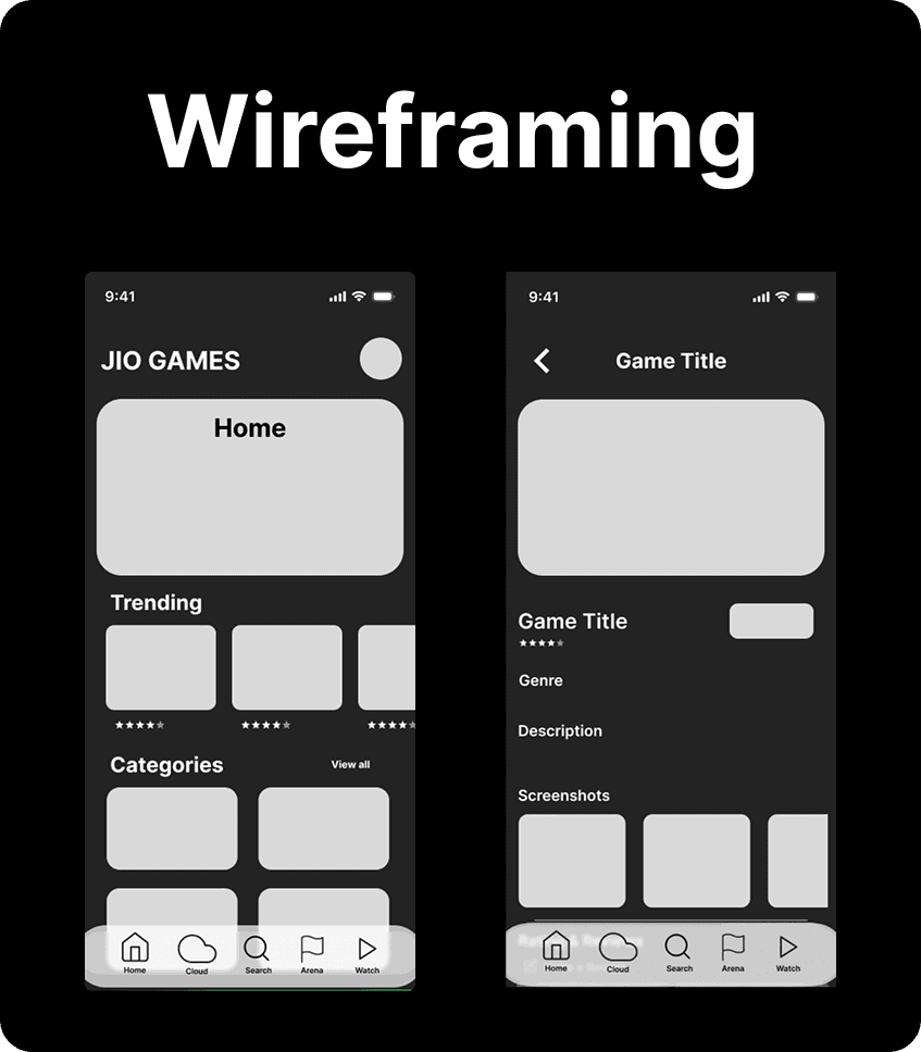
Wireframing & Prototyping: We designed low-fidelity wireframes to visualize the new layout and navigation, iteratively refining them based on user feedback. Afterward, we built a high-fidelity, interactive prototype to test the design.
Usability Testing: We conducted usability tests with a diverse group of users to validate the design and identify areas for improvement. Based on the feedback, we made necessary adjustments to the design.
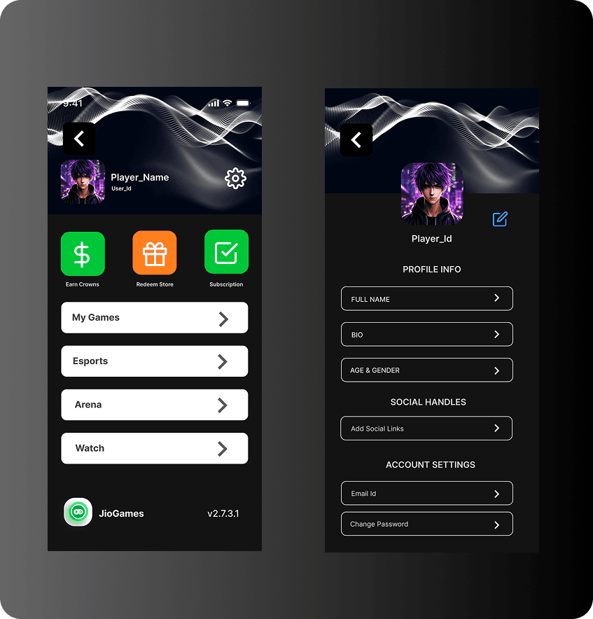
Visual Design & Style Guide: We developed a cohesive visual language, including color schemes, typography, and iconography, ensuring consistency throughout the app. We also created a style guide to maintain design consistency in future updates.
Key Learnings
This project taught me how strategic UX decisions—like simplifying navigation, improving visual hierarchy, and enhancing accessibility—can transform a
cluttered interface into a seamless experience. It sharpened my skills in UX auditing and solving real user pain points through clean, user-friendly design.

Conclusion
The JioGames app redesign successfully transforms a cluttered and inconsistent experience into a streamlined, user-focused platform. By addressing core usability issues and enhancing accessibility, the new design not only improves user engagement but also sets a solid foundation for future scalability and inclusivity.